Magazine design strategy and reasoning
- Purposely chose to make pink and red the main colour scheme to suggest femininity, empowerment and sexuality
- "Millennial Fever" is suppose to suggest resistant to those sexual tones that mainstream magazines exploit for the male gaze, the use of millennial suggests a generation who no longer stand for the exploitation of women
- The doll figure could represent the over sexualisation of women - as the doll could perhaps suggest a sex doll - almost controversial? would bring attention to magazine - but then do i want negative connotations with the magazine? No and the idea is to show women in a strong feminist way not pick them apart as a sexual object
Critic comments:
- overly feminine
- doll figure suggests a feminist magazine
- use of cigarettes? would it be appreciate for a commercial magazine
- generation z vs milleneinial - genderless generation
My thoughts
- Fact it is overly feminine could potentially restrict its audience to females -when I want to achieve a broad audience as much as possible
- Feminist comment - relates to feminism which again in turn could restrict its audience
- millennial comment could be changed to generation z
- use of promoting cigarettes would have to be researched
Magazine design strategy and reasoning
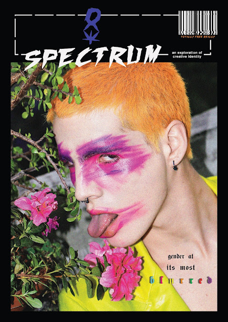
- The photography by Roman Gomez is a blurred expression of gender, the model is male and sporting pink and purple make up that smudge across his eyes and mouth, very Bowie.
- The blurring of the make up links with the 'b l u r r e d' subtitle
- three typefaces where chosen which is a metaphor for the various diversity of gender identity that will be seen in the publication
- The gender symbol logo was designed similarly to the one I designed when responding to V magazine's front cover layout
Critical comments
- the black boarder could strongly would reflect the inner content design
- colourful and bright photography creates a strong image that represents the ethos of the magazine and the title
- perhaps too many different type faces?
My thoughts
- personally feel this is the most representational design for the magazine
Critical comments
- model looks 'alien' like - not relatable
- sexual sensual
My thoughts
- I would have to disagree with these comments as I don't find the image to be sexual and the model is a blend of genders. I think the critic who claimed it to be 'unrelatable' because of the 'alien' is not looking at the bigger picture of gender identity
Critical comments
- reflects the theme of magazine the most
- mainstream
My thoughts
- This particular design is the most mainstream looking design due to the use of gothic fonts which is a major trend at the moment in design and the fashion industry
- Would be good to gain as much exposure as possible
- perhaps restricts the inner content to minimal design layouts


No comments:
Post a Comment