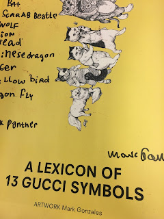
- This particular piece took me by surprise due to the fact childish illustrations were used as part of a Gucci campaign. This opens my mind up to including illustration within the zine, which is an obvious design decision as most zines are known for their handcraft-like aesthetic. However, as stated in the final design briefing I want to create a zine that is visually references mainstream design layouts and content found within fashion magazines, where illustration is usually not present.
- Showcasing boys in androgynous clothing, sporting flowers and make-up is a visual that really pushes and breaks down gender stereotypes and is seen massively in the fashion industry. This particular style of visual would fit the zine very well as I too want to push the boundaries of what gender can be.
- Using block colours behind body text and large display type is a popular trend throughout some magazines
- The strong bold colours really take over the page (in a positive way) and this technique could be used to control the mood of the page/pages that could reflect or perhaps contrast with imagery
- I noticed in a lot of these pages they used blue and pink repeatedly for the text, display type and iconography, possibly as both sexes were being represented - which I thought was interesting
- the tones look similar to the 2016 pantone colours of the year which I have particularly researched into
- In this instant pink or blue is not decided for any particular gender - this could be a focus in the zine - meaning I can explore different colour schemes according to each sex or tone the imagery showcases
"In many parts of the world we are experiencing a gender blur as it relates to fashion, which has in turn impacted color trends throughout all other areas of design. This more unilateral approach to color is coinciding with societal movements toward gender equality and fluidity, the consumer's increased comfort with using color as a form of expression, a generation that has less concern about being typecast or judged and an open exchange of digital information that has opened our eyes to different approaches to color usage."
- Large type is really affective on a blank background. It is clear, crisp and attention grabbing - a technique to use to get a point across I want to make about gender identity
- Including art exhibition photography could be an interesting way of showcasing someones work


No comments:
Post a Comment