Friday, 22 December 2017

masculine and feminine in textures research

"There are some textures that often make us automatically think “masculine,” like leather and naturally-inspired textures like what you’ll find with exposed brick or wood, while softness brings our minds in the opposite direction."


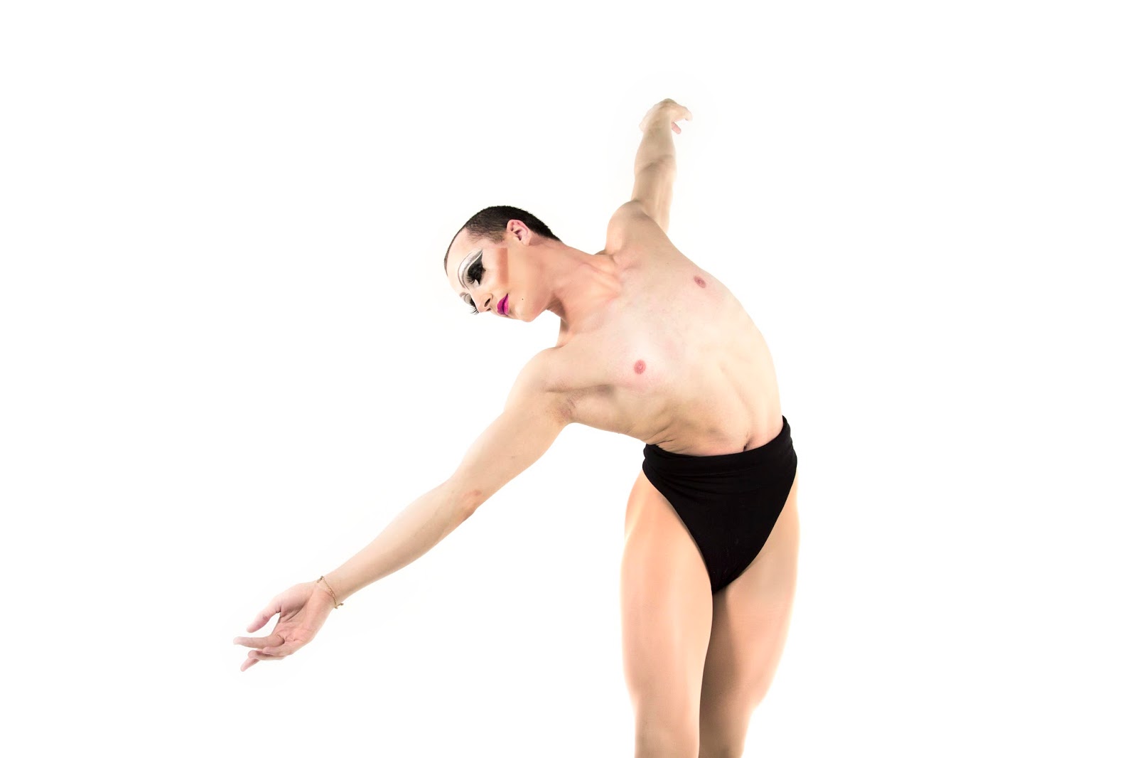
  • this theory of masculine and feminine identities being found in objects and particular textures is something that could be experimented with for my magazine
  • textured pages could represent feminine and masculine accents to reflect the design or imagery to create a deeper meaning for the magazine
  • order g.f.smith paper to experiment prints on


G.F.Smith - exploring masculine, feminine and gender neutral papers

"... the shape and texture of women's lives..."
Women's Worlds: Ideology, Felinity and the Woman's Magazine pg 30

  • Just this simple sentence from a book that was used for women's magazine research triggered a thought of how "shape and texture" could actually be applied to a design strategy to give further meaning to the pages of the publication
  • A magazine arguably dictates the way in which people should lead their lives and whilst researching into semiotics I realised subconsciously the design aspect of the magazine really reflects upon what they want the reader to be or aspire to be
  • Whether its high fashion luxury, overly feminine or masculine content


"Feminine"


Gender neutral 


"Masculine"


Saturday, 16 December 2017

Gender stereotype issues to look at


 Boys in fashion are often displayed as feminine or androgynous, it is really an important issue to push in my magazine.


Links to the part in my essay where I discuss Jayden Smith and impact of him wearing a dress in Marc Jacobs' womens clothing campaign.


Thursday, 14 December 2017

Calling out for submissions via LAU collab page

  • reaches a wide range of designers/artists/creatives = wide range of design work
  • biggest collaboration network available 
  • in PPP session recently we discussed the idea of giving something back or swapping skill sets, so I decided to print out a copy for each of the featured creatives so they have something that showcases their work - hopefully encourages them to want to submit work if they're getting something back


"Hi, hope you all had a gr8 christmas/new year! Calling out for some submissions for a publication I’m creating based around gender identity. Looking to feature any type of work, even if its loosely related. It could be something that is visually “masculine”, “feminine”, androgynous or anywhere along the gender spectrum. Below is one of my submissions so far. You will be fully credited in the publication and I’m happy to get copy to you once its printed. Give us a message on here if you’ve got a submission or email me at domcxrt@gmail.com."

Tuesday, 12 December 2017

Current editorial design research


  • This particular piece took me by surprise due to the fact childish illustrations were used as part of a Gucci campaign. This opens my mind up to including illustration within the zine, which is an obvious design decision as most zines are known for their handcraft-like aesthetic. However, as stated in the final design briefing I want to create a zine that is visually references mainstream design layouts and content found within fashion magazines, where illustration is usually not present.


  • Showcasing boys in androgynous clothing, sporting flowers and make-up is a visual that really pushes and breaks down gender stereotypes and is seen massively in the fashion industry. This particular style of visual would fit the zine very well as I too want to push the boundaries of what gender can be.


  • Using block colours behind body text and large display type is a popular trend throughout some magazines 
  • The strong bold colours really take over the page (in a positive way) and this technique could be used to control the mood of the page/pages that could reflect or perhaps contrast with imagery


  • I noticed in a lot of these pages they used blue and pink repeatedly for the text, display type and iconography, possibly as both sexes were being represented - which I thought was interesting
  • the tones look similar to the 2016 pantone colours of the year which I have particularly researched into 
  • In this instant pink or blue is not decided for any particular gender - this could be a focus in the zine - meaning I can explore different colour schemes according to each sex or tone the imagery showcases
"In many parts of the world we are experiencing a gender blur as it relates to fashion, which has in turn impacted color trends throughout all other areas of design. This more unilateral approach to color is coinciding with societal movements toward gender equality and fluidity, the consumer's increased comfort with using color as a form of expression, a generation that has less concern about being typecast or judged and an open exchange of digital information that has opened our eyes to different approaches to color usage."


  • Large type is really affective on a blank background. It is clear, crisp and attention grabbing -  a technique to use to get a point across I want to make about gender identity


  • Including art exhibition photography could be an interesting way of showcasing someones work