The topics of gender identity discussed within the essay are a reflection of what the practical has to offer. In the essay themes of underrepresentation are evident throughout, focusing on the theory that binary culture dominates western society culture and leaves little space for individuals who identify their gender differently, to express themselves.
In the conclusion it became evident that the way mainstream magazines present themselves, still to this day is a global issue for non-conforming binary individuals. Although it was understood in recent years there have been social shifts when it comes to accepting other gender identities, representation for all gender types does not exist on a mainstream level. Theories between the editors and readers of magazines discussed in the essay provided an insight that concluded that the reader has the ultimate power when it came to processing magazine culture, for example, in the essay some mainstream magazines have changed their content due to social changes. The case study interview with Diva magazine was a interesting insight to how real the issue is.
"Mainstream magazines are definitely getting better at representing queer communities and telling our stories, but they aren't doing nearly enough, and certainly not for those who are marginalised within the LGBTQ umbrella – people of colour, people with disabilities, trans people, intersex people and so on. Queer people with multiple intersecting identities are still ignored, overlooked, and erased."
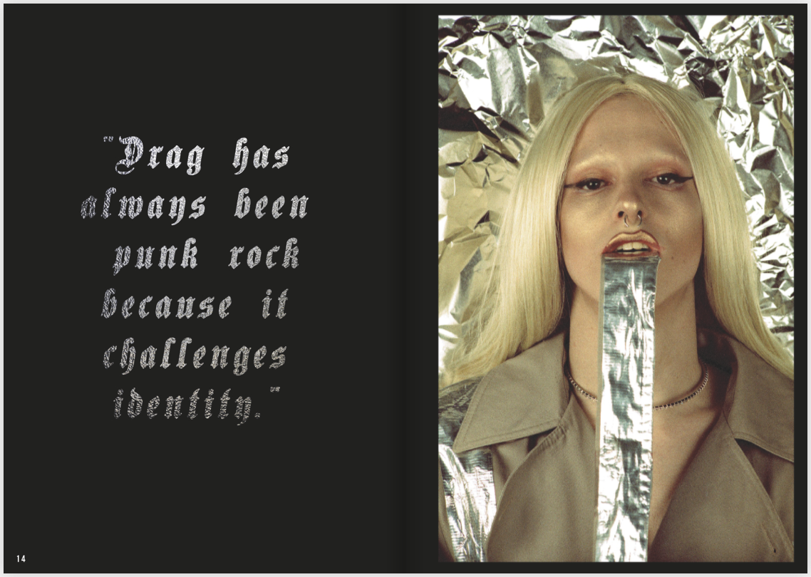
The primary research for the essay muchly inspired the idea of Spectrum. The magazine aims to breakdown gender stereotypes, create exposure for non-conforming binary individuals, promote feminism and be a beacon in magazine culture to inspire readers and future editors to be diverse and forward thinking when it comes to gender representation and acceptance.
The editorial design of the magazine explored experimental design, often found in zine culture, and modern editorial design. Research into mainstream magazine layouts of Paper Magazine, Out and V Magazine were noted and applied to parts of the final design to create a mainstream aesthetic that would bring the magazine attention and also to present the subject matter in a professional way. Influences from existing zines where researched, resulting in an experimental flare within the final resolution. A particular colour scheme was not selected to represent the idea that gender identity is in fact a 'Spectrum', however, black and white page layouts where chosen as a reference to the science of colour, black incasing all colour, whilst white reflecting all colour. The colourful imagery within the publication representing the idea that gender can be anything and it is no longer case of 'black and white' ideals. Pink and Blue pages towards the front and back of the magazine where places as a reference to western society adapting these colours to the two sexes, which ironically the pages in-between do not conform to these ideals.
It was decided that the photography elements where to be a collaboration to create a diverse visual that could not be achieved solely. Photographers from around the world were happy to submit their work and be a part of the publication. The typefaces and layouts used followed modernist trends in order to appear current to represent the forward thinking content of the magazine.
Through the process of writing the essay knowledge about magazine culture abled me to create this magazine that takes on a huge societal issue that exists in western culture. It has given me to knowledge to understand how magazine culture works from editor to reader, the problems of gender identity in society and the power of the people who evidently control mass media outlets.
Wednesday, 31 January 2018
Monday, 22 January 2018


Content development


Various layouts of the type were experimented with.
The typeface was inspired by the ones found in vogue, delicate, thin weight, and italic.
This gives a high fashion tone to the magazine, that reflects successfully with the photographic content, as the models are posed in a high fashion way.


Saturday, 20 January 2018
Final cover design survey
To decide upon a final magazine cover I created a survey on Instagram to see if there was a favourite.


I decided to narrow these two final covers down due to the feedback received in the critical feedback session.
1. Cover was perceived as being the most experimental and representation of the magazine content and ethos
2. Cover was praised for its mainstream aesthetic and minimal design structure


The results:
50/50
out of 58 votes
This gives me the option to choose the cover design. I chose the 1st due to its strong representation of the magazine's theme and the literal link between the title and colours found in the photography and typography.
I got some nice feedback from photographer James Emmerman (2nd cover) though.

Thursday, 18 January 2018
Time Keeping
Essay:


For book research I kept up to date with things by keeping a journal where everyday I updated my progress, wrote down books to research, topics to include and critical feedback comments from sessions.

Kept update with the the first few drafts by keeping reminders and ticking off when completed.
Towards the end of writing the essay I used sticky notes, various other notepads to keep on track, using tick boxes as I went to motivate to finish on time.
Practical:
Kept to tight schedule of producing the book over a course of three weeks. Photographers were contacted as soon as possible as a big amount of the publication relies on it. I found photographers were either really easy to work with or a challenge, some would contact me back within the same day and send the shots as soon as, whilst others agreed to be apart of the project, but never sent the photos - even after reminding them multiple times in a polite professional manor. It took some photographers two weeks to get the shots over, which delayed some of the design process. I designed the graphics as I got each set of photographs, which allowed a fresh approach to each design and gave me time to complete the magazine two weeks before the deadline. The magazine was sent off for production and arrived four days later which gave me time to assess the magazines standards and solve any issues.
Monday, 15 January 2018
Final four covers and crit

Magazine design strategy and reasoning
- Purposely chose to make pink and red the main colour scheme to suggest femininity, empowerment and sexuality
- "Millennial Fever" is suppose to suggest resistant to those sexual tones that mainstream magazines exploit for the male gaze, the use of millennial suggests a generation who no longer stand for the exploitation of women
- The doll figure could represent the over sexualisation of women - as the doll could perhaps suggest a sex doll - almost controversial? would bring attention to magazine - but then do i want negative connotations with the magazine? No and the idea is to show women in a strong feminist way not pick them apart as a sexual object
Critic comments:
- overly feminine
- doll figure suggests a feminist magazine
- use of cigarettes? would it be appreciate for a commercial magazine
- generation z vs milleneinial - genderless generation
My thoughts
- Fact it is overly feminine could potentially restrict its audience to females -when I want to achieve a broad audience as much as possible
- Feminist comment - relates to feminism which again in turn could restrict its audience
- millennial comment could be changed to generation z
- use of promoting cigarettes would have to be researched

Magazine design strategy and reasoning
- The photography by Roman Gomez is a blurred expression of gender, the model is male and sporting pink and purple make up that smudge across his eyes and mouth, very Bowie.
- The blurring of the make up links with the 'b l u r r e d' subtitle
- three typefaces where chosen which is a metaphor for the various diversity of gender identity that will be seen in the publication
- The gender symbol logo was designed similarly to the one I designed when responding to V magazine's front cover layout
Critical comments
- the black boarder could strongly would reflect the inner content design
- colourful and bright photography creates a strong image that represents the ethos of the magazine and the title
- perhaps too many different type faces?
My thoughts
- personally feel this is the most representational design for the magazine

Critical comments
- model looks 'alien' like - not relatable
- sexual sensual
My thoughts
- I would have to disagree with these comments as I don't find the image to be sexual and the model is a blend of genders. I think the critic who claimed it to be 'unrelatable' because of the 'alien' is not looking at the bigger picture of gender identity

Critical comments
- reflects the theme of magazine the most
- mainstream
My thoughts
- This particular design is the most mainstream looking design due to the use of gothic fonts which is a major trend at the moment in design and the fashion industry
- Would be good to gain as much exposure as possible
- perhaps restricts the inner content to minimal design layouts
Sunday, 14 January 2018
Roman Gomez
Roman's work is a perfect blend of a gender blurred world that showcases a colourful vision of high fashion genderless imagery.
I contacted him over Instagram through another featured photographer Morgan Stewart.
Evidence:


 |
| Cover photograph |


Subscribe to:
Posts (Atom)