Point idea
Are album covers relevant enough to be important for an artist anymore?
https://medium.com/the-prototype/the-evolution-of-album-covers-dcb765620102
In those days album covers were very important to the person who bought them, because there wasn’t MTV, there weren’t music videos, there wasn’t the saturation of Youtube or any other available source to learn about your favourite rock n roll star. So an album was very important. You’d buy an album and scour the cover while playing it, looking for clues as to what made those artists tick. We latched onto that early on, by including lyrics, by including postcards, posters and little clues.
in a way it has always been there (artistic expression) they just has to work within a smaller frame of creativity has there wasn't many other ways of expressing etc... so in a way album artwork meant a lot more back in the day compared to now as it was part of only a few ways an artist could express themselves visually.
Sunday, 18 December 2016
Thursday, 15 December 2016
Vinyl vs Digital/Streaming
http://www.latimes.com/opinion/op-ed/la-oe-sax-analog-nostalgia-20160103-story.html
http://www.spin.com/2014/05/did-vinyl-really-die-in-the-90s-death-resurgence-sales/
My passion for collecting records is driven by the same judgment. It was only after I uploaded my CD collection to iTunes, then abandoned that for the endless buffet of streaming, that the unseen benefits of listening to vinyl became apparent. All the digital inventions (MP3s, iPods, Wi-Fi, cloud computing) that brought me free, disembodied music anywhere, anytime, made me value music I can own, display, touch and feel with all my senses. To the millions of consumers worldwide who have resurrected the record industry over the past few years, I suspect the feeling is mutual. To us, the return of vinyl — even as we listen to streaming services on the drive to work — represents not regression, but progress.
Silicon Valley may never look back, but for the generation who has grown up with omnipresent digital technology, nostalgia isn’t just some foolish whim. It is a life raft, and the one sure means of grounding ourselves in a world that promises constant change. My turntable is from the 1970s and so are many of the records that play on it. It can be fixed, modified and restored, but it cannot be rendered obsolete. When disruption is the norm, the real disruption may just be permanence.
Thursday, 8 December 2016
FROOT album campaign research
Marina and the Diamonds - FROOT album campaign
.png)
Uses a mixture of Vinyl "scratch and sniff" single releases that each have their own physical experience as well as a digital one - whether it be a music video or visual that relates to each song through sound, colour and visual aesthetic.

The campaign was titled "Froot of the Month" that went of for six months before the album was released. The campaign was produced to try and reassure the fans of the album's quality by releasing six songs that are each accompanied by a visual world.


Six music videos were released with the six singles. Here are some examples.

The album campaign was also backed by a fashion merchandise.

And a blog that followed the whole album campaign from the first single to the last tour date. The page was filled with Marina's personal photographs, messages, quotes and visuals that have influenced the projects aesthetic.
My interpretation:
For this project it is clear the artist wants their fans to feel fully invested with this album. They do the their best to capture their audience with unique "scratch and sniff" vinyls that are sent out to fans each month six times before the arrival of the album. The fact that
Friday, 2 December 2016
Essay research links
http://leadingusabsurd.com/is-the-album-cover-art-a-dying-art-form/
https://www.theguardian.com/music/musicblog/2008/apr/21/thedyingartofrecordsleeve
https://medium.com/the-prototype/the-evolution-of-album-covers-dcb765620102#.k7usnbafc
http://www.slideshare.net/jspraget1/the-history-of-album-art
https://www.amazon.com/Cover-Art-New-Music-Graphics/dp/B0030ILX4Q
https://www.theguardian.com/music/musicblog/2008/apr/21/thedyingartofrecordsleeve
https://medium.com/the-prototype/the-evolution-of-album-covers-dcb765620102#.k7usnbafc
http://www.slideshare.net/jspraget1/the-history-of-album-art
https://www.amazon.com/Cover-Art-New-Music-Graphics/dp/B0030ILX4Q
Thursday, 10 November 2016
BJORK interactive album
https://www.engadget.com/2014/06/13/bjork-biophilia-first-downloadable-app-in-moma/
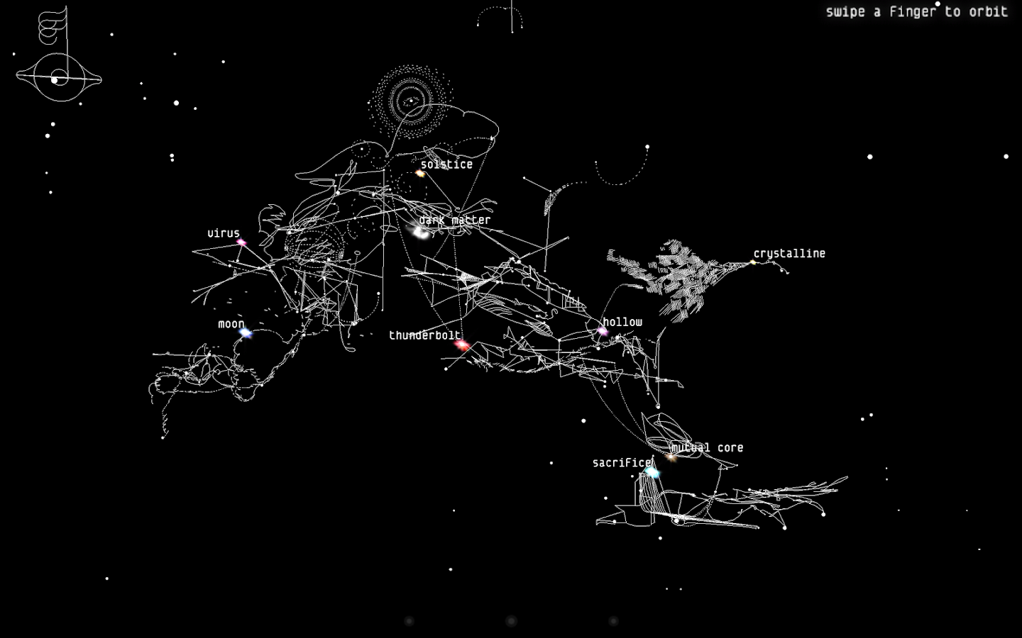
We've seen lots of crazy things on display at the Museum of Modern Art -- a "rain room," a sex toy that works with your phone, a sleeping Academy Award-winning actress. Now you can add "tablet app" to that list. Bjork's "Biophilia," an interactive album released on iOS and Android, has become the first downloadable app to join MoMA's permanent collection. First released in 2011 (and still available for sale), the album allows listeners to "contribute" to songs by playing with interactive on-screen visuals. In "Solstice," for instance (pictured above), the orbits actually allow you to control the string music, with the option to save and record your own version. Ultimately, it was that interactivity that earned the app a spot in the collection. "With Biophilia, Björk truly innovated the way people experience music by letting them participate in performing and making the music and visuals, rather than just listening passively," said MoMA senior curator Paola Antonelli in a blog post.

The Biophilia app consists of a series of 10 separate apps, one for each song, all included in a "mother app" which contains a menu made up by a three-dimensional constellation which the user can shift, zoom and orbit by swiping their fingers to open the apps.[60] The first time the app is opened, an introduction by David Attenborough describes the application and the project itself.[61] This introduction was also used to open the Biophilia Tour residency concerts. On the up left corner, the "musical compass" icon serves as a home button to return to the menu.[61] If the icon is touched when the user is already facing the menu, a list of the application, including two pages for "how to navigate" and "credits", would appear.[60] Every app is named after the corresponding song and includes different options, along with a description of the song and application.[62] This short description link to an essay written for each song by Nikki Debben. The first option in the apps is to play the app, the second is the score, in which the user can look at the composition of the song, use it as a karaoke machine as the score has no vocals in it, or turn off the music and use it as sheet music.[61] The animation option links to an animation of the song created by Stephen Malinowski, in which different forms of different colors, linked to a specific instrument in the song, including Björk's voice, zoom in or out depending on their intensity.[61][63] The fourth option shows the lyrics of the song, which are not available in the "Dark Matter" app as it is sung in gibberish and thus has no lyrics at all.[61][64] The last option is to scroll the credits, which name the people who have worked in the app. The "mother app", "Cosmogony", is the constellation that includes all the other applications, and thus contains no particular game or instrument to play.[60][62] Nevertheless, it contains two other options, which are the possibility to replay the intro narrated by Attenborough and to play the song in its entirety.[60] When the user plays the song, whether they would click on the compass icon they would return to the main menu immediately. Tapping in an empty space of the constellation would also make the user return to the main screen. The apps are roughly divided into two kinds: the ones in which the user play a sort of games, and the other ones that work like a musical instrument.[65]
Almost every song on the app is presented in early, work-in-progress versions. For example, tracks like "Thunderbolt", "Sacrifice" and "Hollow" are missing their percussion parts and beats as they were added to the songs shortly before the album's physical release when Björk decided these early versions were unsatisfactory for a traditional music album. While "Sacrifice" is missing beats and is performed at a slightly lower speed, the most interesting early version of a Biophilia track is "Solstice"; the album version was recorded live during her Manchester residency but the app originally contained a demo version performed in studio. In addition to these work-in-progress versions, several of the games feature the songs with sections of music missing, to be played and manipulated by the player ("Thunderbolt" for example has the player drag their fingers across the screen to play the Tesla coil baseline).
https://en.wikipedia.org/wiki/Biophilia_(album)#App
https://static1.squarespace.com/static/54617fbbe4b0e09964383d07/t/547df7eae4b014d3d288a1a0/1417541610029/201110NYTimes.pdf

Wednesday, 10 February 2016
Practical - Final Concept
Throughout my essay, one of the main focuses is the current state of the fashion magazine. I have explored the depths of how it is adapting in the digital age and how it has developed in recent years to do so.
One particular topic really interests me within the writing of my essay. I explored the way in which particular magazines put themselves out there - design wise. I researched into Elle magazine and LOVE magazine and how their design/way they advertise themselves in recent years and how it has changed - due to the effect the digital age has had.
I mainly focused on the front covers of these magazines and compared them to each other and again to their own various versions of the same issues they put out.
The subscription editions of the magazines were a lot more striped back and relied on the photography and iconic master heads, instead of attempting to grab the reader's attention with lists of the content.
I want to analyse these further and grasp the ideology behind the design reasons and what makes a magazine commercial or indie? What each represent, how each present themselves and how that has changed and is changing due to the digital age.
Creating my own fashion magazine is my aim for this practical work. I hope to create covers that express the typically commercial attributes and then, in contrast, a more free/creative/artist approach.
Representing two types of publications that explore different pathways.
Subscribe to:
Comments (Atom)